
Generating ideas is essential to being an illustrator. It is important to come up with a number of different ideas when presented with a brief and then to work your way through your ideas in order to test if your first idea was correct for the brief. We are influenced by many things around us so it could be that your first idea was generated by something visually you had seen elsewhere, therefore, deeming your idea unoriginal.
The process around thinking of an idea could be described as lateral or parallel thinking. Lateral thinking refers to ‘thinking outside the box’ which could mean your creative outcome may not have a direct link to the message deeming it not obvious. Therefore a logical process is required in order to understand the illustration.
When generating ideas or problem solving, there many ways to get started such as; brainstorming and creating a spider diagram. Brainstorming allows for the illustrator to brain dump all their ideas and thoughts onto paper which could then link to further ideas or illustration. This allows the viewer to see their ideas visually. Spider diagrams see a keyword in the centre of a piece of paper which allows the illustrator to write words that relate to the main word around the keyword. Example of a spider diagram can be seen in Exercise: Spider diagram. These techniques are a great way to generate ideas whilst allowing the viewer to see their thoughts in one place.
Exercise: Spider diagram
For this exercise, I will be creating a spider diagram for the following words:
- Seaside
- Childhood
- Angry
- Festival
And will include, but not restricted to, the following
- my own experiences which could be referenced from TV, photo, film etc
- Objects that I associate with these words
- colours, adjectives, textures and subjects.
- Google images to see what comes up.
Once complete, I will test my spider diagrams with my partner and see if he comes up with different words or the same words which I will list in a different colour in my sketchbook.


In the above spider diagrams, I have listed in pink the words in which my boyfriend listed. it was really interesting to see as his words stayed close to the main word whereas I, branched from the main words and went into a tangent. For example, under Seaside one of my branches ends with Game of Thrones / emotional. I re-explained the task to my partner but he still stayed with his close-knit words.
The hardest word for me was ‘Angry’. I’m not an overly angry person so thinking of past experiences that made me angry was quite hard. That’s not to say I’ve never been angry but, I think it is more the case that I tend to block out those memories and hold memories that have a positive experience to them. The words which I thought of around angry, were close-knit to the main word however here, my partner was able to recall some experiences with anger.
Additional work: Competition with Southend Festival
This section was not an exercise with my OCA degree, however, after my studies so far, I felt confident enough to enter the below competition which I came across on Facebook.

Firstly, I listed the keywords/ sentences from the above post:
- Company: Southend Festival with Forward Motion South Essex
- ‘Reduce reliance on cars’
- Alternative transport: Cycling, bus, train, walking etc
- ‘Active travel’
- Artwork with the above themes
- Winning artwork will be displayed as street art in Southend High Street
From here, I wrote down a few things to think about:
- A piece of art that is suitable to be recreated as street art
I didn’t think a spider-diagram was needed here so I skipped this step and jumped straight into my concept sketches as seen in figure 6:

At first, I found coming up with ideas really hard. After Idea 1, I had a look online at other illustration pieces around public transport. I came across the below images on Pinterest which I really liked and therefore inspired me with my other concept sketches.


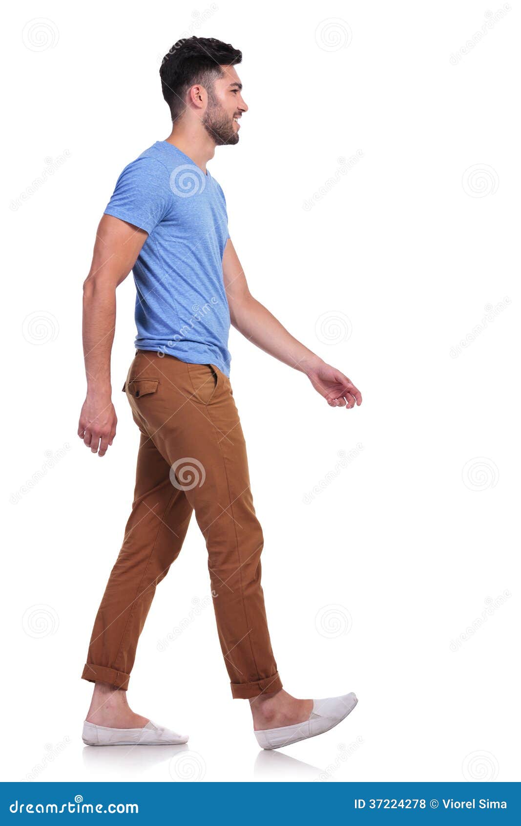
I was most drawn to idea 4 and 5 but after spending some more time working on Idea 4, I decided to go ahead with this concept for my illustration. As I’m not confident in drawing figures in an illustrative way, I used some basic images online to help me come up with the basic shapes of my figures. I used such images as below. These were super helpful as they allowed me to create realistic forms. I would have prefered to sketch these basic forms from a real life model but, there was no one available to help me at this time so I settled with the help of Google.
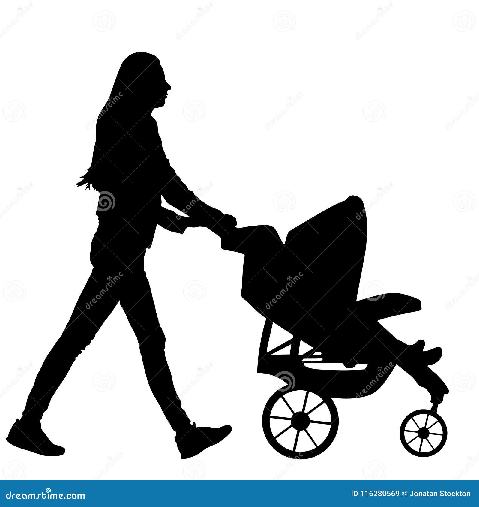


I started to think about body image in my illustration as this is a popular topic to date. I needed my figures to be diverse but I was also limited to space. Originally I produce my adult female figure pushing the buggy in skinny jeans which emphasised skinny legs. I decided to change the shape of her legs and gave her baggy jeans. I decided to do this with all my figures. With the rest of my female figures, I mixed their clothing up to be wearing trousers or skirts to subtly hint to equality and feminism.
I felt that I didn’t need to practice the shape of the bus or the train. I felt confident with my practice sketches of my figures that I went ahead and re-created my concept on a large scale in my sketchbook.

Looking over this sketch, I wasn’t sure if my figures were diverse enough. I planned to include different ethnicities, especially as Southend is very cultural, but did my figures represent body diversity? Maybe this didn’t matter for this type of image? I really liked this sketch so I decided to keep it how it was.
I wanted this illustration to be coloured similar to how I coloured my illustration in Exercise: Getting the gist; using watercolours and pencils. I also noticed that this line sketch had a few paper indents and pencil marks which would show up when colour was added. Therefore, I transferred my sketch, using tracing paper, onto a fresh piece of paper and then lightly removed the pencil lines so that when adding the coloured pencil, the grey of the led pencil wouldn’t dull the colours.

This took me a while to do as I had to decide at this stage what colours I wanted to use for my illustration. I outlined my shapes using a darker colour to what I wanted the main colours to be as this creates a nice crisp edge.
Next, I coloured my illustration using watercolours and once this was dry, I added a layer of coloured pencil to create further definition whilst making the colours bolder. I was a little disappointed with the sky in the middle section as this was a lot darker than the figures in the section which meant the figures got lost in the background. I tried to define my figures by intensifying their colours with my coloured pencils. The figures were still a little lost so I decided to add further definition by adding black using a pencil.

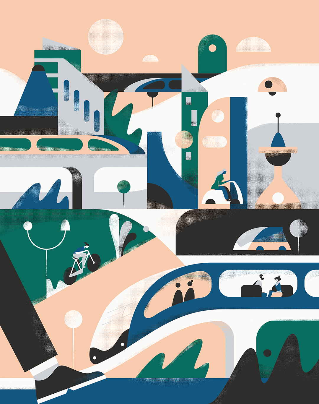
Figure 16, is my final image though I started to question whether it needed a black outline. I scanned the image into Photoshop first and once saved, I trialled a fine line pen on the original sketch. This didn’t work for me but thank goodness I saved an image on Photoshop. In Photoshop, I intensified the colours using ‘Levels’ in photoshop and voila…
Thoughts of my submission
I am really impressed with this image due to the vibrant colours, the concept and the overall look. I like that in some sections, i.e the train, the bus and the tree, I have gone outside of my main canvas shape which has given the illustration a modern look. This technique is something I have seen many times with many digital illustrators and I think it looks fantastic! It makes the illustration less regimented which is perfect for a modern art pathway like graffiti. This technique has also been used by the textiles artist Ana Teresa Barboza who I explored for my assignment piece for Part 5 in my Painting 1 pathway for this degree.
I’m not entirely sure if this illustration is winner worthy. Does it promote active travel? Is it diverse enough? I would say no to both of these questions. Though I have included active travel imagery, I don’t think it is clear that active travel is being promoted here due to my lack of variant tones. If I had made the background lighter and kept the foreground more vibrant, my figures, the bus and the train would be more noticeable and therefore more clear to the audience. With regards to diversity, I don’t believe I have created a fully diverse image. My characters are all thin when in fact, I should have used more rounded figures. I have tried to address ethnicity but this is very subtle. It wasn’t mentioned in the brief for this image to demonstrate diversity however, I am aware that Southend is classed as ‘Culture on Sea’ due to our diverse communities, so I believe I should have included this more in my final illustration
Either way, I’m really pleased I created this illustration as it allowed me to practice responding to a brief, test my illustration skills with figures whilst teaching me to explore the background to the site in which an illustration will be sat. I’ve also realised that I would have benefited from a spider-diagram which the main word being Southend. Maybe through this spider-diagram, I would have realised early on that diversity is key for my illustration to relate to the public in Southend.
Next post: Project: Words to pictures
Bibliography
Behance (2013). Transport, Katerina Voronina, 2013-2015. [image] Available at: https://www.behance.net/gallery/11586797/Public-Transport [Accessed 31 May 2019].
Dreams time (n.d.). [image] Available at: https://www.dreamstime.com/royalty-free-stock-photos-side-view-casual-man-walking-forward-smiling-white-background-image37224278 [Accessed 31 May 2019].
Dreams time (n.d.). [image] Available at: https://www.dreamstime.com/woman-baby-pram-silhouette-isolated-white-background-vector-carriage-young-walking-little-child-stroller-trolley-image116280569 [Accessed 31 May 2019].
facebook.com. (2019). The Southend Festival. [online] Available at: https://m.facebook.com/photo.php?fbid=621457964987760&id=412767219190170&set=a.606181753182048&source=57 [Accessed 31 May 2019].
Kuilder, T. (n.d.). [image] Available at: https://dribbble.com/shots/3961115-Transport/attachments/904913 [Accessed 31 May 2019].
The Guardian (2010). Go Green by Galia Bernstein Photograph: London Transport Museum. [image] Available at: https://www.theguardian.com/environment/gallery/2010/jul/08/london-transport-museum-cycling-illustration-competition#/?picture=364655066&index=14 [Accessed 31 May 2019].
